10 Home Lighting Design Rules That Make Any Interior Look Better
MORII DESIGN JOURNAL
Most homes are lit, not designed. The difference lies in how light is layered, directed and controlled.
These 10 home lighting design rules explain how colour temperature, concealed light, mirrors, natural light, dimming and placement can make an interior feel warmer, deeper and far more considered.
Layer Your Lighting: Ambient, Task and Accent Light
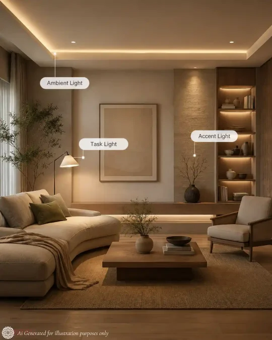
A beautifully lit home should not depend on one bright ceiling fixture. The most effective home lighting combines three layers: ambient, task and accent lighting.
Ambient lighting provides the room’s general illumination through ceiling lights, pendants, wall lights or concealed cove lighting.
Task lighting provides focused illumination where it is needed—for reading, cooking, working or grooming.
Accent lighting highlights features such as artwork, plants, shelves, textured walls or architectural details, creating contrast and visual depth.
A single ceiling light illuminates from only one height and direction, which can make an interior appear flat. Instead, combine ceiling-level ambient light, eye-level lamps and focused accent lighting to create depth and atmosphere.
Stand at the entrance of the room after sunset. If all the light comes from the ceiling, add one source at eye level and one focused light for an artwork, plant or textured surface.
- Ambient lighting provides overall illumination.
- Task lighting supports specific activities.
- Accent lighting creates focus and depth.
- Use light at different heights.
- Several controlled sources are better than one bright fixture.
The Best Light Source Is Often the One You Cannot See
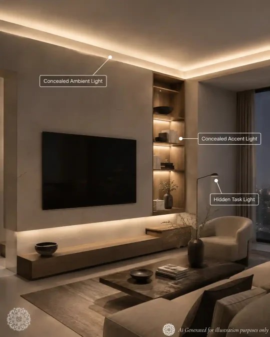
The most refined interiors often hide the source of light and reveal only its effect.
Concealed lighting can sit inside ceiling coves, beneath shelves, behind mirrors or under cabinetry. The result is a softer glow with less glare and a stronger sense of depth.
Visible LED dots, exposed strips and overly bright bulbs can make an otherwise beautiful room feel unfinished. Whenever possible, use recessed profiles, diffusers and hidden edges so the light washes a surface instead of shining directly into the eye.
The principle is simple: let people notice what the light reveals, not where the light comes from.
Stand at normal eye level and check whether the LED strip or bulb is directly visible. If it is, hide it behind an edge, recess it into a profile or add a diffuser.
- Concealed lighting creates a softer, more refined effect.
- Use it in coves, shelves, mirrors and cabinetry.
- Avoid visible LED dots and exposed strips.
- Diffusers help create an even glow.
- Light the surface, not the viewer’s eyes.
Choose the Right Colour Temperature for Every Room
Colour temperature determines whether a light appears warm, neutral or cool. It is measured in Kelvin (K), and it can completely change how a room feels.
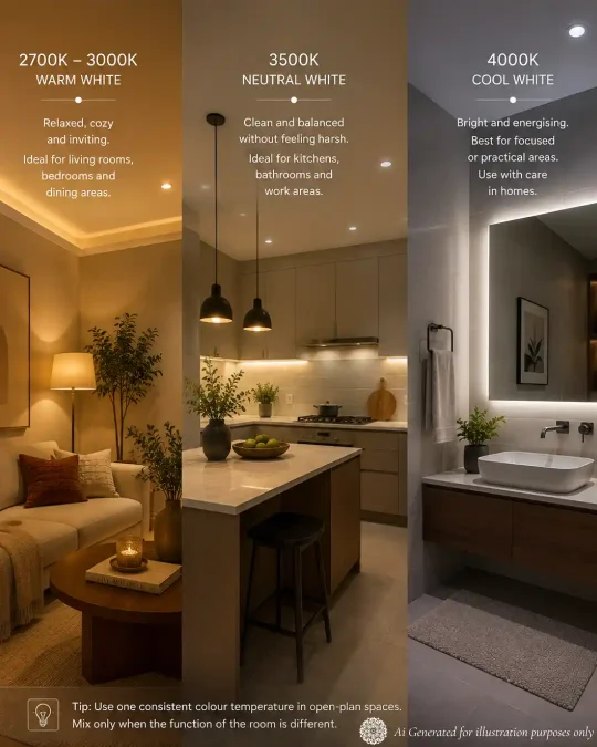
Warm light between 2700K and 3000K creates a relaxed, inviting atmosphere. It works especially well in living rooms, bedrooms and dining areas.
Neutral light around 3500K offers a cleaner appearance without feeling too clinical. It can suit kitchens, bathrooms and work areas where both comfort and visibility matter.
Cooler light around 4000K feels brighter and more energising, but it should be used carefully in homes. When overused, it can make an interior feel harsh or commercial.
The biggest mistake is mixing noticeably warm and cool bulbs within the same view. Even beautiful fixtures can look disconnected when their colour temperatures do not match.
Use one consistent colour temperature throughout an open-plan area. Introduce variation only when a room has a clearly different function, such as a home office or utility zone.
- 2700K–3000K creates a warm and welcoming atmosphere.
- 3500K gives a cleaner, more neutral appearance.
- 4000K is better suited to focused or practical areas.
- Avoid mixing warm and cool light within the same room.
- Choose colour temperature basis the mood and purpose of the room.
Check CRI Before Buying Lights
Colour Rendering Index, or CRI, shows how accurately a light reveals the colours of objects compared with a natural reference.
A low-CRI light can make wood, fabrics, artwork, food and skin tones appear dull or distorted—even when the room is bright.
For general home lighting, choose a CRI of at least 80. For mirrors, dining areas, artwork, kitchens and rooms with rich colours or materials, CRI 90 or above provides better colour fidelity.
CRI is useful, but it should not be the only measure of light quality. Beam control, glare, colour temperature and the way the light is positioned are equally important.
Before buying a bulb, check both its colour temperature and CRI. Choose CRI 90+ wherever accurate colours, finishes or skin tones are important.
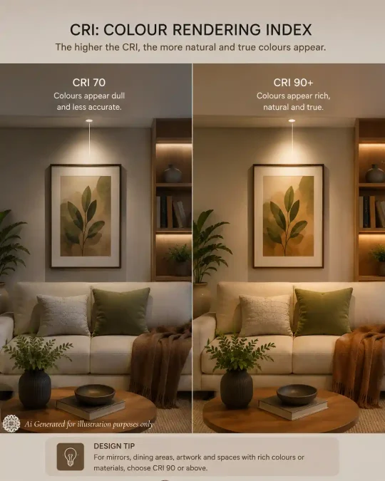
- CRI measures how naturally colours appear under a light
- CRI 80 is suitable for general interior lighting.
- CRI 90+ is better for mirrors, artwork, dining and detailed finishes.
- Bright light is not always good-quality light.
- Always consider CRI together with colour temperature and glare control.
Buy Light by Lumens, Not Watts
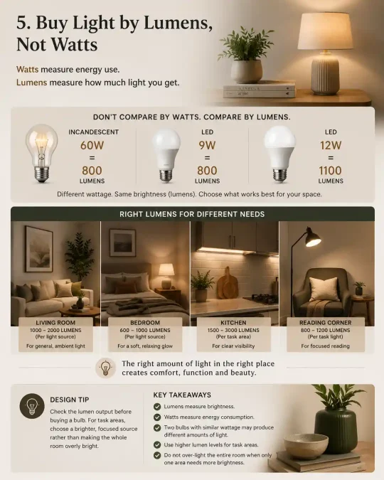
Many people still choose bulbs by wattage, but watts only measure energy use. Lumens tell you how much light the bulb actually produces.
A low-watt LED can often provide the same brightness as a much higher-watt traditional bulb. That is why comparing bulbs by watts alone can be misleading.
The right lumen level depends on the room, wall colours, ceiling height and how the light is being used. A reading corner needs focused brightness, while a bedroom usually benefits from softer, layered light.
Instead of making the whole room excessively bright, use more lumens only where they are needed.
Check the lumen output before buying a bulb. For task areas, choose a brighter focused source rather than increasing the brightness of every light in the room.
- Lumens measure brightness.
- Watts measure energy consumption.
- wo bulbs with similar wattage may produce different amounts of light.
- Use higher lumen levels for task areas.
- Do not over-light the entire room if only one area needs more brightness.
The 30–60–10 Brightness Rule
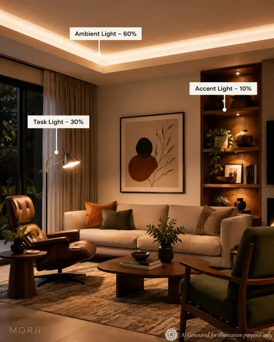
A well-lit room should not give every light source equal importance. A useful way to create balance is to divide the room’s visual brightness into three levels.
Use approximately:
60% for ambient lighting — the room’s main, comfortable glow.
30% for task lighting — brighter light where activities such as reading, cooking or working take place.
10% for accent lighting — focused illumination for artwork, shelves, plants or architectural details.
This is not a strict calculation. It is a design guide that prevents a room from feeling either uniformly bright or unnecessarily dramatic.
The ambient layer should remain dominant, task lighting should provide clarity where required, and accent lighting should be used selectively to create contrast.
Switch on each lighting layer separately. When the accent lighting attracts more attention than the room itself, reduce its brightness or narrow its beam.
- Use ambient lighting as the dominant layer.
- Add stronger light only where tasks require it.
- Keep accent lighting selective and controlled.
- Avoid making every part of the room equally bright.
- Treat the 30–60–10 rule as a visual balance guide, not a rigid formula.
Mirrors and Light Work as a System
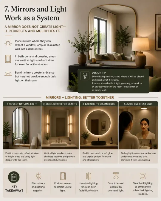
A mirror does not create light—it redirects and multiplies it. That is why mirrors and lighting should always be planned together.
Place mirrors where they can reflect a window, lamp or illuminated wall rather than a dark corner. This helps distribute light deeper into the room and can make the interior feel brighter and more spacious.
For bathroom and dressing mirrors, avoid relying only on a ceiling light. Light falling from above creates shadows beneath the eyes, nose and chin. Vertical lights placed on both sides of the mirror provide more even facial illumination.
Backlit mirrors create a soft decorative glow, but they may not provide enough task lighting on their own. Combine backlighting with side lights when accurate grooming light is required.
Before fixing a mirror, stand where it will be placed and check what it reflects. A mirror should reflect light, greenery, artwork or an attractive part of the room—not clutter or an empty wall.
If you are looking to buy a full size mirror – check this blog to choose the perfect one – Read the Blog .
- Plan mirrors and lighting together.
- Position mirrors to reflect useful light into the room.
- Use side lighting for clear, even facial illumination.
- Do not depend entirely on overhead light above a mirror.
- Treat backlighting as atmosphere unless task lighting is provided.
Natural Light Has a Direction — Work With It
Natural light changes throughout the day, and its direction affects how a room looks and feels.
East-facing rooms receive softer morning light, while west-facing rooms become warmer and brighter in the evening. North-facing rooms usually have cooler, more consistent light, whereas south-facing rooms receive stronger sunlight for longer periods.
Plan furniture, mirrors and colours according to this movement. Place reading chairs, work desks and breakfast areas where useful daylight is available. Use sheer curtains to soften harsh sunlight without blocking it completely.
Artificial lighting should support natural light, not compete with it. Darker corners may need extra illumination, while bright areas require less.
Observe the room in the morning, afternoon and evening before deciding where to place furniture, mirrors or lamps. The best arrangement may change once you understand how sunlight travels through the room.
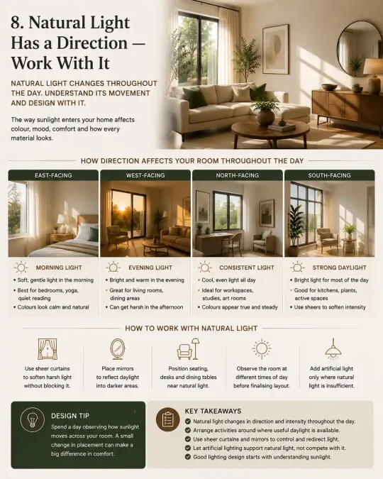
- Natural light changes in direction and intensity throughout the day.
- Arrange activities around where useful daylight is available.
- Use sheer curtains to soften glare while preserving brightness.
- Position mirrors to redirect daylight into darker areas.
- Add artificial light only where natural light becomes insufficient.
Dimmer Switches Are Not Optional
Good lighting should change with the time of day and the activity taking place. A fixed level of brightness cannot create the right atmosphere for every situation.
Dimmers allow the same light to be bright for cleaning, cooking or working, then softer for dining, relaxing or entertaining.
They also improve layered lighting. Ambient, task and accent lights can be adjusted independently, preventing every fixture from competing at full brightness.
Always confirm that the bulb, driver and dimmer are compatible. An unsuitable combination may cause flickering, buzzing or uneven dimming.
Install separate dimmers for ambient and accent lighting. This gives you greater control than placing every light on one circuit.
- Lighting should adapt throughout the day.
- Dimmers make one room suitable for several activities.
- Control different lighting layers separately.
- Lower brightness can create warmth and depth.
- Check bulb, driver and dimmer compatibility before installation.
The Height Rule: Light Travels Down or Up—Never Sideways
Lighting placed near eye level should direct its beam upward, downward or towards a surface—not straight into the room.
Sideways-facing exposed bulbs often create glare because the brightest part of the fixture remains directly visible. This is common with poorly shaded wall lights, table lamps and open decorative bulbs.
Use pendants and downlights to direct light downward, uplighters to illuminate ceilings, and shaded wall lights to wash light above or below. The fixture may remain visible, but the bulb should usually be concealed from normal viewing angles.
The principle is not that light can never travel sideways. It is that people should experience the glow—not stare directly into its source.
Sit and stand in the room before finalising fixture heights. When the bulb is visible at normal eye level, adjust the height, add a shade or choose a better-shielded fixture.
- Avoid exposed light sources at eye level.
- Direct light upward, downward or onto a surface.
- Use shades and diffusers to control glare.
- Check fixtures from both sitting and standing positions.
- Let people see the effect of light rather than the brightest part of the bulb.
Frequently Asked Questions About Home Lighting Design
From colour temperature and lux levels to dimmers and CRI, these are some of the most common questions homeowners have when planning lighting for their interiors.
How many lumens or lux do I need for a living room?
Lumens measure how much light a source produces, while lux measures how much of that light reaches a surface. For a living room, roughly 100–200 lux is a useful starting point for general illumination, while a reading or other task area may need approximately 300–500 lux locally. Room size, ceiling height, wall colour and natural light all affect the final requirement.
How many light sources should a living room have?
There is no universal number. A smaller room may work well with two or three carefully chosen sources, while a large living room may use five or more. What matters more is combining light at different heights and for different purposes instead of simply adding fixtures.
Are recessed ceiling lights enough for a living room?
Usually not on their own. Recessed lights are useful for general or targeted illumination, but a room consisting only of downlights can feel flat and overly bright from above. Floor lamps, table lamps, wall lights and accent lighting create the additional depth and flexibility that living rooms need.
How far apart should recessed downlights be?
A common starting rule is to space ambient downlights at approximately half the ceiling height, but beam angle, fixture output and furniture layout matter just as much. Philips India’s residential guidance also recommends considering distance from walls rather than simply arranging lights in a ceiling grid.
Is 2700K, 3000K or 4000K better for home lighting?
For living rooms, bedrooms and dining areas, 2700K–3000K generally creates a warmer atmosphere. Around 3000K–4000K can work better where greater visual clarity is required, such as kitchens, bathrooms or work areas. The right choice depends on the function and character of the room rather than one Kelvin value being universally superior.
Should all the lights in an open-plan room have the same colour temperature?
Usually, yes. Noticeably different colour temperatures visible at the same time can make an open interior feel visually disconnected. If you do vary colour temperature, it should normally correspond to a deliberate functional zone rather than different bulbs being selected randomly.
Why can two bulbs marked 3000K look completely different?
Kelvin describes the apparent warmth or coolness of light, but it does not describe the complete quality of the light. CRI, spectral distribution, diffusion and the fixture itself can all affect how colours, skin, wood and fabrics appear. That is why two 3000K LEDs can produce noticeably different results.
Is CRI 90 really worth paying more for?
It can be, particularly where colour matters. Higher colour rendering is valuable around artwork, mirrors, fabrics, timber, food preparation and carefully selected interior finishes because those materials appear more naturally under better-quality light. Many current residential-lighting recommendations now favour CRI 90+ where colour fidelity is important.
How do I make a dark room brighter when it gets very little natural light?
Do not simply install one extremely bright ceiling fixture. Add several sources at different heights, illuminate walls or ceilings so light can bounce back into the room, and place task lighting where it is actually needed. Where some daylight exists, mirrors and lighter window treatments can also help redirect it deeper into the interior.
Can lighting make a small room look bigger?
Yes, perceptually. Lighting vertical surfaces, corners and different heights creates depth and prevents the boundaries of a room from disappearing into darkness. Designers also recommend layered lighting rather than one central source when trying to make compact living rooms feel more open.
How do I stop LED downlights from looking harsh or creating glare?
Avoid fixtures where the bright LED source remains clearly visible from normal viewing positions. Deep-recessed fittings, anti-glare baffles, diffusers and lights aimed at walls rather than directly towards the eye can substantially reduce visual glare.
Why do LED lights flicker or buzz when I use a dimmer?
A common reason is incompatibility between the LED lamp or driver and the dimmer, particularly at low dimming levels. Not every LED labelled dimmable behaves well with every dimmer, which is why manufacturers publish compatibility information.
Should I install dimmer switches in every room?
They are especially worthwhile in living rooms, bedrooms, dining rooms and other multi-use areas because the same fixtures can provide strong functional light when needed and softer illumination later. Current designer guidance and homeowner discussions repeatedly identify dimming as one of the simplest ways to gain more control over a room’s atmosphere.
What is the best lighting around a bathroom mirror for makeup or shaving?
Avoid relying entirely on a ceiling light above the head because it can create shadows across the face. Diffused lighting positioned symmetrically on both sides of the mirror, approximately around face height, provides more even illumination; good colour rendering is also particularly useful here.
Can I create good lighting without installing a false ceiling?
Absolutely. A false ceiling is not a prerequisite for good lighting. Surface-mounted fixtures, tracks, pendants, wall sconces, floor lamps and table lamps can create a sophisticated layered scheme without recessed downlights at all — an especially relevant option for Indian homes where owners may not want to sacrifice ceiling height.
Good Lighting Is About What You See — Not the Light Source
Beautiful lighting is rarely about adding more lights. It is about deciding where light falls, what it reveals and what remains in shadow.
A well-lit home combines ambient, task and accent lighting with the right brightness, colour temperature and direction. It works with natural light, uses mirrors deliberately, controls glare and gives you the flexibility to change the atmosphere as the day progresses.
Most importantly, good lighting should complement the architecture, furniture, materials and objects within a room rather than compete with them.
The principle worth remembering is simple:
The best source of light is often the one you cannot see.
When you notice the warmth of the wood, the texture of a wall, the colour of a fabric or the form of an object before you notice the bulb illuminating it, the lighting is doing its job.
- Layer light instead of relying on one dominant source.
- Control brightness, colour temperature, direction and glare.
- Use light to reveal materials, objects and architectural details.
- Allow natural and artificial light to work together.
- Design for atmosphere as well as visibility.
- Let people experience the light—not stare at its source.
Explore thoughtfully designed furniture, décor, textiles and objects created to bring character, function and detail into considered interiors.